
(Image by Kyle Walton on Flickr)
Most of Metro’s station entrances these days have canopies to protect patrons and escalators from the elements. It wasn’t meant to be this way, as Zach Schrag documents in his book The Great Society Subway. For numerous reasons, however, we have them now. With that in mind, DC Metrocentric has a recent post up on the elegance of the canopies at Columbia Heights – how they blend in to the surrounding area, fit well with the nearby architecture, etc.
I can’t help but comment on these canopies – because I really dislike the Columbia Heights (and Petworth, for that matter) canopies. Unlike the other canopies in the system, these ones may look fine from the outside, but they violate a number of the basic design precepts of the entire system. There’s something to be said for individualized stations and station entrances, but for better or for worse that’s not part of the Metro system. Instead, Metro is marked by remarkable continuity between stations with common design elements and common materials.
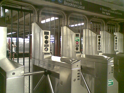
One of those core principles is to maximize volume. This isn’t just for grandeur, either – the voluminous train rooms in Metro’s underground stations provide clear sight lines for patrons to see the mezzanines and easily visualize the circulation routes to get in and out of the stations. Similarly, Metro designers explicitly wanted to stay away from associations with older, enclosed systems in Philly, Boston, Chicago and New York – that meant fare gates are unobtrusive, unlike their caged cousins in New York.
The Columbia Heights canopies violate a couple of these points. Though they enclose a lot of space, they sure don’t feel voluminous. Because the canopies sit rather low on the station’s parapet, the gap between the outside and the escalator shaft feels enclosed. It doesn’t help that the gap is enclosed with a combination of public art and metal bars. It feels more like a cage than a canopy.

(Image by dbking on Flickr)
Where older metro entrances have their ‘doors’ and gates used to close the system at the bottom of their escalator wells, these stations have them at the top of the escalators as part of the canopy. This necessitates the caged feeling, since it functionally is a cage. Undoubtedly, this is done to eliminate homeless people sleeping at the bottom of the escalators but the effect is detrimental to the overall design.
Finally, these canopies don’t identify which part of the structure is the entrance. This isn’t a huge critique, because the canopy-less stations have the same problem. However, given the fact that the canopies do exist, the more common design does a much better job of identifying where to enter the system simply by design.

(Image by dbking on Flickr)
The soaring canopy fits Metro’s design much better. It provides the necessary shelter for both people and equipment, maintains the openness of the station entrances, clearly indicates where one enters the station, and harmonizes well with the rest of the system’s architecture. The ‘scooping’ of the canopy clearly indicates which end is the entrance. The curvature of the canopy, combined with the individual panes of glass evokes a clear parallel to the original coffered vault station design.
For freestanding station entrances, this is the better option.
However, they’re not a cure all. The U Street Metro’s 13th Street entrance is a great example.
Here, the canopy ‘opens’ to a wall. Not so good. Perhaps a better option would have been to integrate the station entrance into the structure itself, as is done quite successfully in several downtown stations. This also would have been a viable option for the Columbia Heights stations and might be a more functional way to achieve the individuality for each station that DC Metrocentric wants. Not every entrance should be a grand plaza. It works in some spaces (like Eastern Market, where the plaza is already there), but in others it can be detrimental. Potomac Ave is a great example – there’s plenty of open space in the adjacent square that could be far better utilized. The plaza around the station itself is underutilized. If the land could be developed and the station accessed via a ‘retail’ storefront kind of entrance, the station area itself would gain density and uses, as well as improvements to the urban deisgn of the area.

Leave a comment